
Professional Quality, Every Day

Professional Quality, Every Day
In the volcanic regions of southern Japanーrenowned for natural hot springs born from ongoing volcanic activityーCreate Ion identified a mineral-rich volcanic rocks with properties unlike any other.
Formed under intense heat and pressure over thousands of years, these volcanic minerals naturally emit negative ions and far-infrared energy. Create Ion Technology was born from the pursuit of unlocking this power. Through a proprietary refinement process, the volcanic rocks are carefully reduced to a fine mineral powder and integrated into its technology.
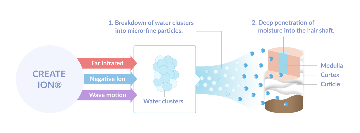
Create Ion Technology uses these minerals in their products to naturally emit negative ions and far-infrared energy to break the water clusters into microscopic particles that can penetrate deeply into hair and the outer layer of the skin. The result is hydration that feels light yet lastingーhair that retains moisture without heaviness, and skin that appears balanced, smooth, and refreshed.
By uniting Japan’s hot-spring-rich volcanic terrain with modern scientific precision, Create Ion transforms the earth’s natural mineral energy into a refined ritual of careーwhere beauty is not forced, but awakened from within.
Unlike conventional tools that rely on intense heat alone, Create Ion technology is designed to create a more balanced styling environment. Negative ions help reduce static and frizz, while far-infrared energy supports even heat distribution.
Working together with controlled airflow, this balanced approach allows hair to dry and style more smoothlyーhelping maintain natural moisture while enhancing manageability and finish.
